OUGD203: Design Practice 2
Module Evaluation
1. Your ability to select, develop and evaluate a range of appropriate source material gathered through a breadth of appropriate research methods.
As the project took a while to set off contextual research relating to design direction was slow and did not really happen until the third week of progress. However to this I did research well into the company itself, looking at websites making visits to the store to speak to members of staff and emailing Ryan Holliday-Stevens, the designers of their fashion. This led to lots of research directed at their competition, in particular looking at window displays within the local area, which eventually led to looking at other companies and installation design by other designers.
I feel I could have looked at more direct research into Autumn/Winter displays which was the initial idea that I was working with, however as I wanted the design direction to be more in keeping with the off-trend fashion of the company I chose not to look at design relating to the seasons.
I also feel I could have done more research into the design of the printed media, looking at more contextual designs of clothe tagging and carrier bags may have produced much more innovative designs and shapes.
For the collaborative brief I felt the research that I looked at was strongly directed at paper based media, which was very relevant to the design direction of the brief, and among this was strong primary research into competitors of the company and varied secondary research into design direction and contextual research sources. this research was both relevant to the brief in hand as well as supportive of my own personal investigation and practice. I felt that Hannah researched some-what better than myself, taking a more concentrated view of contextual research as her specialist skills lie within paper-based media. I thought however that a wider perspective on research benefited the project as influences came from a variety of sources.
2. The level of investigation and experimentation into appropriate production media, processes and technologies.
As the company 'aqua' is small the need for mass production on printed media is small, therefore most items would be printed digitally to save on costs. On the Fedrigoni brief mass production was considered as well a the use of appropriate stocks.
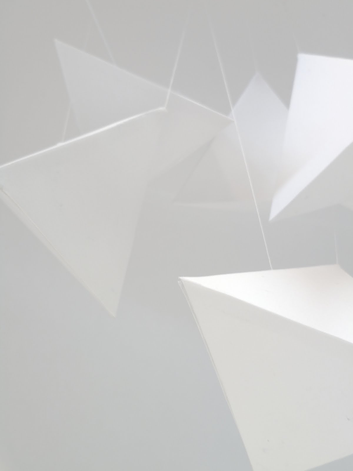
Having looked at installation designs for the Aqua brief, most are tailor-made for the space itself, however I have not considered the implication of more stores being created and more stores needing a unique design layout, as there is a distinct visual styling this should allow a transferrable visual styling between stores. I could however have been much more experimental with use of stock choices, shapes, textures and colour with the design of the clothe tagging as well as bags. I feel that if I had looked much more deeply into the construction f these different types of media I could have produced something much more interactive, like the installation design.
Studying the web- design aspect of the aqua brief also showed me how much more I need to learn about putting a website design together and how digital media is one of the most important parts of the process and unfortunately I feel I didn't look into this part of the design process as much as I could have done. I do intend therefor to consider how great web-design is becoming a more important part of graphic design.
3. The breadth and quality of practical skills, ideas and development.
I found the Aqua brief particularly difficult, the border between 3D design and graphic design, where does it end? I think this could have hindered the way the project developed I was very interested in producing something interactive but I felt I was held back to notions that what I was producing was 3D 'fine art'. I therefore started looking more at
For the Fedrigoni Brief myself and Hannah took control of the designing of the space right from the start, the breadth of ideas was large and through working collaboratively and independently we were able to deliver a fantastic design solution for such an open brief.
My practice lies within layout and image through less illustrative means, I feel I could have produced more thumbnails of designs that would have helped the process of design and tested the potential of the layout possibilities of the poster design. Non-the-less I feel I produced a strong visual solution with a real attention to detail and aesthetics, reflective of my design practice.
4. The documentation, organisation and presentation of the work for this module.
BY keeping basic time-sheets of when work needed to be completed I was able to keep track of my progress, although gaining momentum with creating my own working brief I found particularly difficult.
Once the Aqua brief started to progress I documented the early stages of brief well but as I stared to become closer to the final resolution I feel I lacked the time and documentation skills that I had documenting the early stages of the brief much like the YCN Collaborative brief.
It was quite hard to document work within a 3D space, taking photographs not often gave a good representation of the work that I was producing and so I believe I didn't document the latter half of the project well because of this. Also focussing on the boards and the printing of them, designing for the project seemed to take a back seat.
5. The success of your final products in relation to the briefs.
Overall I think I have created a design solution for Aqua that works really well with their existing material but works as an innovative design solution. Developing a brief that I would find interesting was really hard but because I decided to work for an existing client whom I could have contact with, this of course led me to focusing early on on their existing material and not enough designing, I could tell of all sorts of information about the company but little in the way of what I could do for them.
In relation to my statement of intent I wanted to look at installation design, and so I did. But I feel I could have been more experimental, as said in my statement of intent I found there was little in the way of visual material to work with which actually led me to a shortage of ideas because of little design direction to go in.
this project has taught me that designing for retail is particularly difficult especially when you are working very open-mindedly, but I do want to continue this further. I intend on heading back to Aqua to propose the visual solution for the design of the window space, based on talking to the client I think I cheap negotiated design solution could be possible.
for the collaborative brief I feel myself and Hannah produced a design solution that was innovative and different from what we would normally have produced, I have now learned to really appreciate the aesthetics of minimal type and layout design. The boards that we created for submission I feel suggested professional working graphic design practice and
5 Things I will do differently next time and comments:
#01 Don't let the client take hold of the design direction, try being innovative and go beyond the expectations.
#02 Continue to document all stages within the design process and I the blog as more of a daily diary as oppose to a documentation simply for submission.
#03 Look more in-depth into design for web a very profitable design market, what makes good digital media?
#04 I have a tendency to become lazy once I have found a visual solution to a problem and don't always follow up that solution greatly to produce an innovative range.
#05 If in doubt, always seek advice as this may prove a point of inspiration.


.jpg)
.jpg)