Tuesday 24 November 2009

OUGD201 Design Production - Print

1. Your ability to select, develop and evaluate a range of appropriate source material gathered through a breadth of appropriate research methods.
Initially breaking the subject matter of the "What is Good?" project I managed really well and through my initial pieces of investigation research I actually changed the subject of eavesdropping to overhearing based on the facts I obtained in researching. The material that I selected especially for the research could have been better in terms of its quantity, although the subject matter of the "What is Good?" project seemed limited in its content, after working on the project I think there were so many other directions in which I could have gone with the project, I only really exhausted obvious points of research and was less spontaneous early on. Throughout the development stages I used a lot of designers and and references to pull the concept together, looking at illustrators to brand identity design to influence and gain knowledge of what it is I wanted to achieve. I also completed one survey throughout the project, here I think I could have done more and unfortunately with the time constraints I have not had time to bring my resolutions to the client because of their availability, but I intend to show them what I have achieved at a later date, for the useful experience.
2. The level of investigation and experimentation into appropriate production media, processes and technologies.
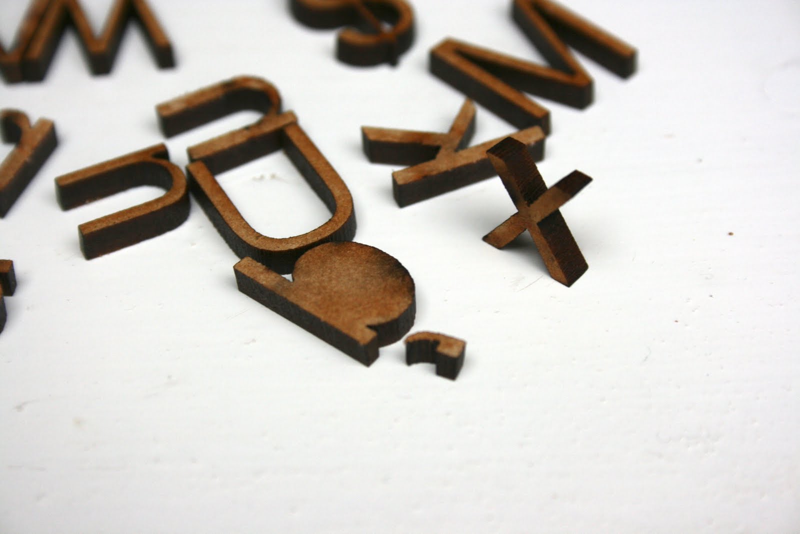
The outcome for the "What is Good?" project was a branding, this branding could be seen on articles which you would normally find in a coffee house , I ended up producing a new menu design, business card, window vinyls and a mock-up coffee cup holder. influenced a lot by that idea of professional practice, the final outcome made use of various print processes which was part of the aim of the module and I practiced a lot of screen printing and finishes as well as digital printing to printed media and I also used a laser cutter to create crafted details and looking at how to emboss.
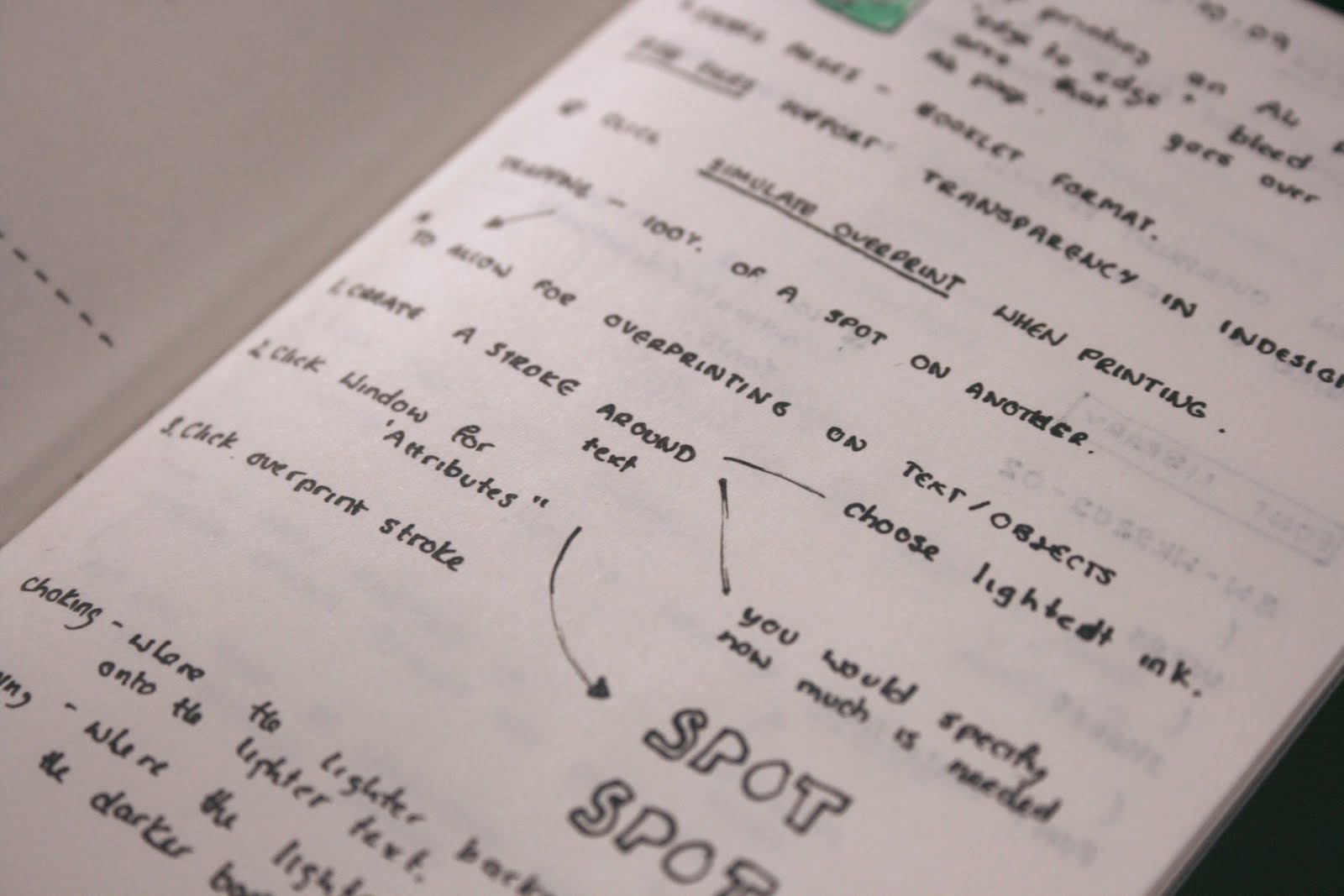
For the development in the production of the 16 Page Publication on print, a lot of the sources were secondary with the exception of workshops in Indesign and Photoshop, other than this I was looking at referencing useful books which I think I could have gone further with looking at printing in professional practice as not all facilities to print are available to me at the college, such as offset-lithography and flexography processes.
3. The breadth and quality of practical skills, ideas and development.
Looking at expanding my use of mediums and such I think I definitely tested, using screen printing and digital printing to create some interesting pieces which made use of various print processes. I think I could have gone further however with my design development and concept development, because I felt the subject of overhearing physically limited I limited myself in a way as to what I could do to package it. Having last year often used sketch books and such to document my ideas I went for sheets, it helped dramatically when presenting my ideas and I found the bigger the better. I would like to consider using bigger sheets as this often inspired me more than a daunting blank sketchpad of ideas.
4. The documentation, organisation and presentation of the work for this module.
I do not think that the work that submitted in digital form truly represented to what extent I researched and how much I really got involved with especially the "What is Good?" project. Maybe because I didn't document everything digitally where I used the blog to update my findings and such verbally as oppose to placing in images of the physical work that i was collecting. In terms however of my organisational skills, they have vastly improved. Using not only the google calendar but arranging my time using my personal diary and trying to use my time effectively, more so than I ever have done the previous year. In a similar sense I have also been taking pictures and properly documenting my work and what I have been doing not only n the course but I have also been doing creative things and even visit exhibitions more than before as well as organising times to print work and use facilities properly, and I think because of this I have been much more critically aware of the creative practice in general.
5. The success of your final products in relation to the briefs.
Mainly through sheer determination and the talks on professional practice I have stepped up to creating work that is better and quality and more importantly I see it through from the start to the finished product. For the branding created for the "What is Good?" project, it was very conceptual as to whether or not the product would work, but the concept allowed me to explore print based media not just as how it comes out of a machine but creating effects after digitally printing the product and knowing the knowledge I have now of the subject, I feel I could have done more, maybe created something which is more tactile and a physical product as oppose to a branding. But this project allowed me to see the bigger picture of design, by simply asking a local cafe business to help support what I was trying to do the idea of professional practice and working for someone seemed to make my final ideas more feasible.
The 16 page booklet however I felt didn't meet the expectations of what I had in mind of it achieving, the book although takes into account lots of the printing processes and such used I felt that I didn't really learn anything that was new, using only secondary sources for research I felt the information I was obtaining and documenting seemed to be simply copying existing knowledge. For the book I wanted it to use things that I had learnt in the workshops and be less of a copied, churned out book that is a miniature version of The Production Manual.

5 Things I will do differently next time and comments

1. Look for more primary sources of research and consider contacting/visiting professional practices in relation for research.
2. When developing ideas be more experimental, consider using a larger pieces of paper or illustrating concepts out bigger or straight away, and use more mock-ups.
3. Take time out to reflect and re-evaluate before committing to a concept, there could be another more successful direction to go in.
4. When presenting concept try to deliver in an orgainsed manner such as starting from the beginning or the end instead of making references to points or different times.
5. Look less at what other people are working on around me as a distraction from what I am working on and be confident on the concepts I am trying to achieve.

Sunday 22 November 2009


Final 16 Page Publication on Design for Print.
Whilst looking at print processes for the current briefs this came a bit late on practicing but I looked at embossing and de-bossing as part of the 16 page publication design. The process relies on creating a die, two embossing plates that mesh together. As part of my ongoing exploration I asked down in the print rooms how such an effect could be achieved, having used a cuttlebug embossing machine before I was sure that it would involve pressing a plate through a heinenberg press (I think that is what they are called). Basically I would have to create a die-plate first in order to make something, I was told using the laser cutter to cut stencils of type and such would when pressed through the plates, create the embossed effect. Unfortunately the laser cutter at college is not available to graphic design students... so I went elsewhere. Back when I did my GCSE's I did some laser cutting work at the South Leeds City Learning Centre and I worked with a woman called Anna Clapham, whom I called up and asked for a favour.
The result was some laser cut type which unfortunately I dont have the time to test before ht module hand-in but I thought it was worth while putting the pictures up as the type is lovely to look at anyway. I also tried working with a plastic material but being plastic it melt with heat and so some of the type did not cme out very well, these pieces in 3mm MDF however are loely just to play with. I intend to try and emboss with them after the module hand-in, just to se what I can actually get out of them.

Friday 20 November 2009

Graham provide me with some great feeback about the book design and I was so glad I talked to his before I printed otherwise it could have been a very messy and costly affair. there were a number of things I needed to sort out, well 'refine', the basis of the document though was there with the information and the layout choices.
1. The page layouts which I had initialy chosen was wrong for some of the pages.
It seems like the bee all and end all of everything but Graham assured me with such a small document it could be changed with ease. because the book had such a long cover which on the reverse ran into the pages behind (see images) I created a a4 landscape document which when the internal pages were in an A5 portrait format this posed problem especially with alignments.
2. The margins were 'tiny'.
The final chosen grid was a five column which was the same equal width of that of the gutters, 4.233. Although this gave a harmonious effect the way the page was laid out the margins that were set out when printed were in fact half that size because I had laid out the page as of it was an A4 document. This presented great problems when it came to text near the margin on the inside of the book because they were so close to the crease it made your eyes hurt. I ended up doubling the margin and doibling it again at the books' crease.
3. The ascender height isn't always the top height.
Not maybe an essential layout consideration but where I had decided to align some text with an image I had aligned it with the ascender, it looked nice but what Graham spoke about was how if the word is written in lower case text the optimum line of height changes in particular with those that have a mayority of letterforms with x heights, so I changed it to align with this instead in particular areas.
4. Point size could be a problem.
I have thought about this, working myself I normally write incredibly small and short pieces of small text especially where I have linked references I thought was an incredibly good idea. But graham brought up the fact that if the tutors cannot read it it could affect what they see and might affect my grade. These were viewed on a laser printed black and white sample and having used the ink-jet printers in the digital print rooms I have found them to be far more accurate and should have a better resolution and therefore be easier to read.

When printing today after speaking to Graham I had found a couple of proof-related issues. First of all because I have new software and the college computer were working on an earlier version I had to convert the file properly without losing clarity of the document. This was relatively simple until I found out that some of the images that I had used had missing links, and oh my did that take a long time to produce and even when that went right when I corrected them automatically, other images were chosen in their place. Frustrating times, yet the outcome of the book looks really nice. Being only three duplex pages I decided to print all of them for submission, simply because I could and it gives a better insight into the structure.
I suddenly have occasional breakthroughs while I am asleep because I dream every night or I just wake up randomly with an idea in my head. Whilst I was sleeping I woke and suddenly had this interesting idea of how the publication on print could look.
In sight the book is plain and simple with a belly band around the middle. Once taken off the book become split into two, separating the two sections of print production, preparing to print and post & pre-printing finishes. Each side is composed of 6 pages each detailing different print process and such but also my note which I have been taking throughout the course of the module on print (see earlier post). I was quite impressed with myself, making a mock-up there and then at three in the morning.

Thursday 19 November 2009

The design of the 16 page book has taken some time to become resolute, but thanks to some useful input from Graham Tansley just before I was about to print the resolution came properly together. Having not shown how the book has been developed I thought that a good idea would be to put some pictures up as well as the final pages which are to be handed in on Monday with the "What is Good?" project.
My initial research was about obtaining the size, what would this thing look like in my hand, or would it even be in my hand? I started develpoing and questioning what the book was about, it needed basically to show my good understanding of print processes. One of the first examples I looked at which first inspired me was the design of a unknown publication (above) which was actually a series of publications I found via the Behance Network which were about different typefaces. I just loved the tactile quality of these as a whole, the way pages turned not only gave maybe a dull subject something special but it was a quality that could be appreciated by most people. I also quite liked the layout of this as well, the single typeface in different sizes and compositions made it feel more harmoniously designed and of greater value.
So playing on the idea that wanted to create something that was more interactive and tactile I wanted to produce a small hand-held publication which could possibly be constructed using a single typeface which made good and effective use of a grid (see above). As for the content at this point, it was being driven through the notes that I had been taking in the various Indesign and Photoshop workshops and the purchase of The Production Manual by Gavin Ambrose (2008). These help in looking at what kind of content I wanted to include, after all I was loking at compiling a near 200 page document into a 16 page document which means that unless the information is incredibly small I was going to have to be selective about the infomration that I was collecting, for instance my immediate thought was not to look in detail about different printers such as lithograpy, flexography etc but to discuss what I was interested in such a looking at finishing techniques such as foil-blocking, spot-varnishing and tactile design, but also looking at what I didn't know about print such as the way linted colour pallets are used, print-proofing and limited colour pallets really interested me aswell, Having loked at the One Colour Graphics by Joshua C.Chen (2002) and Two Colour Graphics by Templin Brink Design (2004).

Sunday 15 November 2009

Not specifically related to the work I am currently doing but, relates in my exploration on looking at print processes, I produced this week some screen prints for my partner using the technique of flocking. This process produced a furred effect on the surface, created by screen printing a glue instead of an ink then placing a furred paper in the top which when heated transfers the fur onto the glued surface. Its a really nice effect, and he was very impressed with the outcome. Next I would like to produce some in a tiffany blue colour hopefully to sell and I want to experiment further by doing some foil work and using different inks. There is a exhibition space in Leeds, The Loft hosts on sundays an exhibition space where you can sell crafts and such which would be perfect if I create some more. See PDF.
For the branding of the coffee house I've been creating some samples. For part of the design I wanted to produce some window graphics as part of the visual style. So picking James' brain down in the digital print room and I made these samples using some clear vinyl and the vinyl cutter. I thought these were quite cool. although the cutter gave me grief and started ripping the plastic and leaving some areas untouched, I did inevitably have to cut them out by hand, but I was very pleased with the result. I just created some quick samples by drawing out a small image and enlarging it on illustrator using the live trace tool, so they're a bit 'vectory' but I'm gonna work on them.