Based upon the crit feedback that we recieved it seemed that what we were wanting to produce lacked impact. After negotiating and taking some time out to reflect on what we had produced there were a couple of issues:
+ Impact Factor
+ Typeface Selection
+ Layout design


Almost the crucial thing that needed to be there lacked that quality that makes the design jump out and speak to the viewer. Hannah and I both decided to go home and think about what we were wanting to produce. I decided to stay a bit longer and work on the project.
It just needed to be simpler. The design had become much more complicated and the amount of information that were were wanting to communicate made it hard to actually see what were were wanting to put forward 'Don't waste this space.' I decided to break down the information to the actual basics of what we needed to be there using the simple idea.
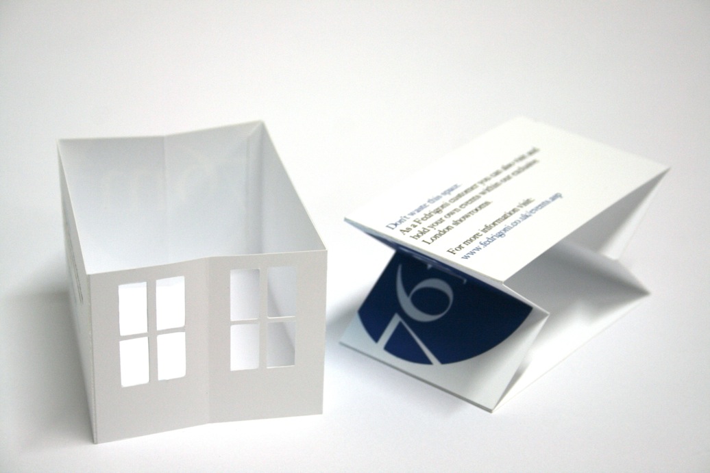
Don't waste this space.
As a Fedrigoni customer you can also visit and
hold your own events with our exclusive
London showrooms.
Using language such as exclusive indicated a much more personal tone and directed the viewer to something because it was not just generic. Using the 'Don't waste this space.' as more of a tag-line almost asked the viewer to do something about this, almost like an order. I decided to put this in context with the poster and proposed various designs and layouts below.
I worked out that we were trying to produce lots of information and deliver in too little space. Why not deliver it across several different ones? From this I then took the visual I had generated and created a series of 4 posters. Each comprised of a separate piece of visual information which would be printed on a gorgeous piece of stock. This could be tailored to each different consumer pack giving a feeling of a individuality and accentuated that idea of speciality.


 The adjusted position of the dates appears to fit with the whole look of the business card. It appear much more effective and by utilising the blue circle creates an added consistency between the designs.


