


The design of the 16 page book has taken some time to become resolute, but thanks to some useful input from Graham Tansley just before I was about to print the resolution came properly together. Having not shown how the book has been developed I thought that a good idea would be to put some pictures up as well as the final pages which are to be handed in on Monday with the "What is Good?" project.
My initial research was about obtaining the size, what would this thing look like in my hand, or would it even be in my hand? I started develpoing and questioning what the book was about, it needed basically to show my good understanding of print processes. One of the first examples I looked at which first inspired me was the design of a unknown publication (above) which was actually a series of publications I found via the Behance Network which were about different typefaces. I just loved the tactile quality of these as a whole, the way pages turned not only gave maybe a dull subject something special but it was a quality that could be appreciated by most people. I also quite liked the layout of this as well, the single typeface in different sizes and compositions made it feel more harmoniously designed and of greater value.
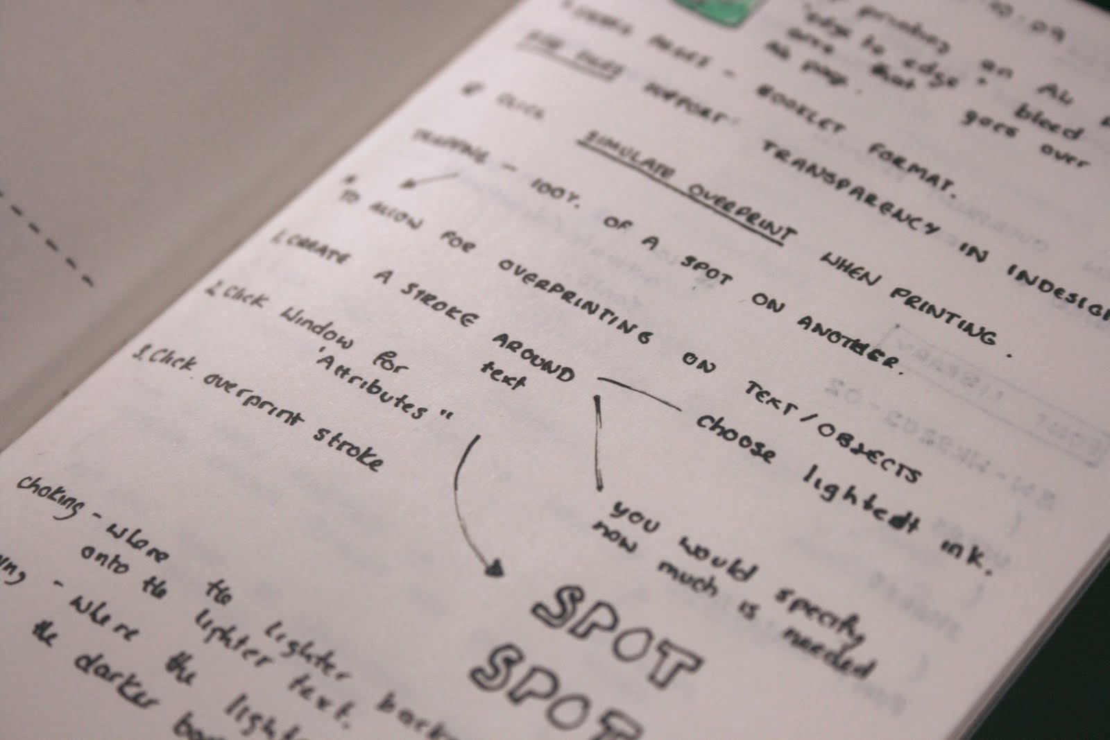
So playing on the idea that wanted to create something that was more interactive and tactile I wanted to produce a small hand-held publication which could possibly be constructed using a single typeface which made good and effective use of a grid (see above). As for the content at this point, it was being driven through the notes that I had been taking in the various Indesign and Photoshop workshops and the purchase of The Production Manual by Gavin Ambrose (2008). These help in looking at what kind of content I wanted to include, after all I was loking at compiling a near 200 page document into a 16 page document which means that unless the information is incredibly small I was going to have to be selective about the infomration that I was collecting, for instance my immediate thought was not to look in detail about different printers such as lithograpy, flexography etc but to discuss what I was interested in such a looking at finishing techniques such as foil-blocking, spot-varnishing and tactile design, but also looking at what I didn't know about print such as the way linted colour pallets are used, print-proofing and limited colour pallets really interested me aswell, Having loked at the One Colour Graphics by Joshua C.Chen (2002) and Two Colour Graphics by Templin Brink Design (2004).


No comments:
Post a Comment