Wednesday, 11 November 2009

Today I met with a potential client for the What is good project, Anne Mansell, the owner of the Bees Knees Coffee house. Overall it was a really good experience, she introduced herself as a lovely down to earth woman, whom was very interested in what i had to say and offer. I began by talking about myself and the degree I was doing and moved onto talking about the project Ihad been working on and how I felt it could benefit a coffee type business. She seemed to be quite interested and like the ideas that I was playing on and thought that overhearing subject and the quotes were really interesting.
I asked about the business and how I never knew that the store was a flagship for catering and such. The place has changed several times from being a Art gallery to a restaurant and eventually leading to the coffee and delicacy shop sometimes with a mix of them in-between. Within the district of Morley the cafe had been designed to be more of a high profile business which reaches the sophisticated end of the market as oppose to local diners and sandwich bars. With more success in the catering business in the season of christmas and running side-line businesses Anne's priorities and work-load at the moment are massive, I was very appreciative of the fact she had taken the time out to talk to me. Unfortunately taking on a job of looking at the visuals and branding was not possible due to the mounting workload and inability to provide payments and such for visuals and menus etc, I was sympathetic, the phone did ring about four times whilst I was there. But I expressed that in-spite of this the project would still go ahead because it for my degree and client feedback on things I create would be fine, Sam from Essex who was working downstairs had created the menus and such for the cafe and Anne said if she wasn't available I could converse with her.
I learned a great deal about the business itself and what customers they attracted, this should help inform my design decisions later and I was able to get some sample menus and the new seasonal menu. They seemed to like the Window Graphics that I had produced and Sam gave me some idea about what could be done with the menu.
Overall quite productive and I'm moving onto doing some screen printing tomorrow for the coffee sleeves. I want to look more at costings as I didn't have a clear idea myself, if only justin was in to talk to. And also I thought I shouldn't just limit myself to this one cafe in Morley, I should see if there are any more locals that are interested in the design concept, but I am so pleased with the fact my work is seeming that bit more professional this should be a big boost in my portfolio.
Above are some of the previous designs for the menu and below the current seasonal menus which was recently developed.

Saturday, 7 November 2009

After Finding out my initial research and defining my "What is Good?" I had to pitch my concept about how I was going to Package and Promote Overhearing to my fellow peers and tutors. The crit was fantastic, my idea was highly thought of and it seemed from the feedback inspite of a nervy introduction my concept was clear and without being too cliche "Good".
There were several things that were commented on:
1. Encourage conversation? or Promote Overhearing?
The message I was trying to communicate was slightly confusing, some thought that I was trying to communicate conversation by means of quotations on media and such. The way I intend for this proposal to work is indirect. The quotes themselves are taken from overhearings, the way it promotes is though creating conversation and a talking point, which fuels indirectly overhearing, which creates a continuous cycle.
2. Stock Choice?
I've been thinking something in an eco material, ideally with a rough kind of grain to it. But having now settled with a client for this brief I would like their input aswell.
3. Content - Will the content be generic? Is the content appropriate for the target audience?
The content of the quotes is not fueled by myself, it comes directly from the audience, it is in effect/or should be a content that is appropriate for the audience. I have had thoughts about how I could change the visuals monthly much like a retail shop would, this would help as it keeps the coffee house up-to date, which could be more enticing for the customers having a change of visuals when they come in. Alternatively I could just create generic visuals that can be used all year round, not specificaly related to any seasonal events such as the x-factor.
4. Cost?
I intend to look at how much material consumption a coffee house takes by using my client and from there I can work out pricing. I also would like to talk to justin burns and the enterprise and innovation expert Bridget about how much I should charge for my time.
5. Subtlety - Do you want people to notice the content straight away?
Yes, these quotations are not only part of the visual brand but essentially need to stand out in order to create conversation to which overhearing can take place. Having them in a subtle manner would mean they are not seen, being subtle would be more in the way of the eavesdropping which is about looking with intent for something which is not what I am trying to achieve.

There were also a couple of comments about the media I was going to use, printed napkins and cupholders were particular favourites but what was also mentioned about heat sensitive inks and how if they were used on stirrers they could react to hot drinks to reveal messages. Overall it was a very constructive and supportive crit.
In terms of how the project has evolved, I gave in my presentation a run down of how I got to where I am at the minute. First the generic lists and spider diagrams of which allowed me to indentify a particular subject matter, in both groups and by myself.
This led to eavesdropping and from here I researched mostly through the internet about the subject. Looking at information such as cctv, reality televsion, photography, Audio recording, google earth etc but what I found what I was doing was searching and it almost seemed perverse. I therefore slightly altered what I was doing to Overhearing. This research led to a small quantitive survey which revealed that people do overhear and are likely to divulge information to others and lots of audio recordings aswell as quotations from them.
The Presentation was successful and most people liked the concept and the information I was working with.
To Package & Promote my initial ideas were varied but I needed to put overhearing with something. Initial ideas were about printing the quotation on something to communicate and persuade people to overhear, these ranged from looking at Penguin biscuit jokes, fortune cookies, eggs, envelopes and sugar packets. but there lacked purpose and more importantly Indeed a context to put these in. I had an initial idea in mind that was inspired by Bridget Marsh who was asking for artwork for some coffee houses whom she knew of. The context of the Coffee House.
Overhearing in context with coffee houses became entertainment and more importantly it was useful, in particular for sparking conversations which I realized created a cycle of events. People in conversation is overheard which creates conversation which is then overheard again, this cycle promotes overhearing as it passes from one person to the next.
So I began some contextual research, looking in particular at articles used in coffee houses such as cups and general stationary media. In particular I looked at limited colour pallets and packaging where a visual style had been created and almost an identity was apparent. What was particularly inspiring was some illustrated cup I found, personally I would be intrigued and want to purchase items from this coffee house. which also led to how the campaign visual would profit the coffee house, as said before it could create an enticing view which could attract new customers, from there some interior visuals would create more of an impact, customers would be more likely to spend and purchase more items as they may stay longer and come more often, increasing the coffee house IPC.
Having established a good context for the visuals to sit I have begun designing, looking at where visuals could be placed and what they take form in. Handmade text has always appealed to myself and I think I could create some beautiful illustrations alongside to really make and interesting visual style. These will ultimately be digitally printed through various print processes and such and I have been looking at adding colour to the visuals as well. The next stage in my design development is to start drawing and experiment with layouts, I also would like to see if the client approves of this kind of visual style and one important thing to remember throughout, I am promoting Overhearing is good.

The brief just got serious, I have my first client!
Having established a firm idea on what I was wanting to do for the "What is Good?" project, the main thing to do next was to just do it. So today after I got my hair cut I popped into a lovely cafe in Morley, having never been in this cafe before I had no idea what to expect I was just going to get a coffee to go but I was pleasantly surprised with the delightful atmosphere which had a very 'homey' feel. I loved it, and as I sat there drinking my latte I couldn't help but think "Ok, this is my client." Their menu lacked the qualities of a good design, probably using Microsoft Word which is ok for a quick mock-up, but the feel of the place I thought could be so much better with some exciting visuals and illustrations. Having that 'homey' feel gave me some great ideas of what I could do, using different eco paper stocks for menus and their business cards, they also offer hampers, catering and buffets to order. They even do THEMES! So I asked the people who were working there and presented myself as a professional graphic designer and proposed verbally some ideas about what I could do for them, they even asked for a business card, to which I couldn't give but they took my number anyway.
They were looking definitely for some new menus as they were looking to expand their menu lists and seemed very interested in the visuals especially for windows and such. the ladies that were attending the place said they would pass my name and number onto their manager and I could maybe come with some visuals and things (I'll have to look at pricing too) on wednesday.
I'm going to look at creating some proper visuals over this weekend and will talk to James in the print studio on monday about pricing on papers and the vinyl cutter which I would really like to use, I also want to talk to Justin about how much I could charge for this.
Overall I'm uber excited, and I suppose if it doesn't work out I can do it hypothetically but even so, I have a name for my client and a contact, Anne and Chris Mansell are the owners of Bee's Knees: Delicatessen & Coffee Bar.

Thursday, 5 November 2009

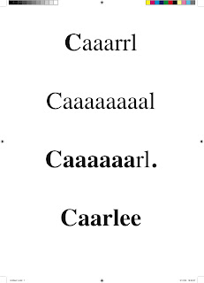
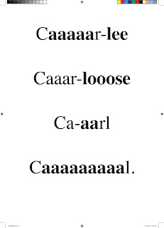
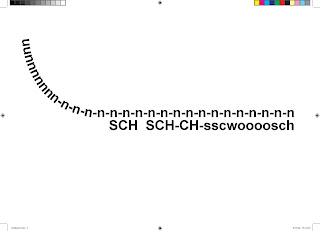
Back in the game once again it has been a chaotic week with lots of information to take in and being back in the studio environment. The session with Graham Tansley started again, and today we took what we had being doing back to at start and applying the knowledge we had learned to new scenarios, in a similar typographic fashion. We were looking at phonetics and trying to communicate sounds through the use of text and it charactistics such as its size, weight and position. First we tried to communicate our names by how they are said by other people, mine being a single syllable word I found quite difficult, but through emphasising the vowels and splitting the word a tiny fraction gave a good indication of how it is said. It can be subjective as different accents create different sounds.


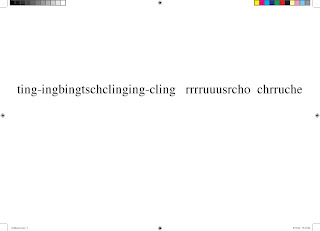
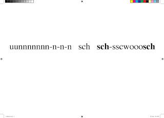
The next part involved representing sounds, the first thing that came to mind was putting a key in a door (first one below). Aside from the fact it does look like gibberish there was logic, the first part, the keys were jingling, the second the key was put in the door and the third the turning which I think could have been held out longer as it was so quick. Apparently there were a series of books produced out of speaking phonetically so that the accent of the narrator would shine through the words, which could be interesting to look at. For the second I chose a more simple and easy example, a bus slowing into a lay-by and the doors opening. For the last we experimented more with layout and so I started to think about multiple sounds and direction, where the bus would be moving and to where it stand stationary with the engine still running. A hard task indeed, but very interesting and frustrating the way people still had no idea what you were communicating.

Having not blogged on my practice for a while I thought I'd give you a couple of updates. Firstly and most importantly about the choosing of the modules, Type or Image? I have chosen to opt for the Type module. I feel I have learned what I can from image making, through the visual language brief last year I think I have gained an understanding from the sessions on basic shape constructing to the visual exploration of what could be a line? Type on the other hand is something I never really touch upon, I have a few select typefaces as my favorites and I could work out a good layout but I want to know more and become proficient at it. I think as a career choice there are far better illustrators and image makers than myself, that is not to say I cant illustrate at all. As a professional I could work well as a layout artist providing I have a good knowledge base which would be useful to a career for the design of graphic products, editorial, even as a brand identity developer. I have also had developments in both the "What is good?" and the Enterprise & Innovation module to come.

Thursday, 22 October 2009


The Type and Layout sessions with Graham Tansley on a thursday morning have now finished due to the reseach week next week which gives me time to reflect on what I have done in the workshops and where to go from here. Type or Image? I still have no idea what I would like to do, I would like to feel that I am a confident layout orgainsiser who has certain typefaces for favorites and likes to draw and compose images in his spare time.
The workshops with graham have taught me various things about type, working with appropriate point sizes, weight, case, serif/sans serif and using them effectively in situations to reflect their usage, readability, legibility etc. Then moving onto sentences and paragraphs when the use of these factors alters to suit the needs of its application, and today moving onto the use of a full page spread which is kind of fun to play with. But most of what we have learnt, I have realised, is subjective and the opinions of how you read and such differ from each individual. This was most apparent when working with single works where even each serif became significant to the design and was I think why when it came to designing the layout for some sample text plus images the results were so varied and a lot of it came down to personal tastes. Who was right/wrong?


Wednesday, 14 October 2009

I couldn't help overhearing.
Looking at the act of listening into someone else's conversation and why it is good.
Firstly, a common misconception. Overhearing and eavesdropping are not the same. Eavesdropping is the act of secretly listening into the private conversation of others without consent. However, if a message is publicly broadcast, witnessing it does not count as eavesdropping, this is overhearing.
So why is overhearing good?
for several reasons...
So from a social aspect, overhearing allows the circulation of behavior of others and through this, humanizes them by being able to compare and contrast information against others to help define social statuses, so an example would be someone talking about another person but not talking about another, the listener is impartial and from this can learn where to place this person with an informed decision.
Another aspect of social advantages of overhearing would be finding out secret information of other, which has its obvious advantages.
To help with the social side of this I also completed a short and simple qualitative questionnaire. Results from this were conclusive. People do overhear conversations and are likely to divulge information to other.
Overhearing also benefit through an increase in knowledge, and information can come as factional or fictional, it is a choice of course as to whether you believe the information that you hear. You may also find that information that you hear supports your arguments or information that you already have. Through overhearing you can also obtain information about what a majority of people think based on their opinions.
Overhearing is free, and also unlike gifts it is also free to give, but you can put a price on the information that you hold.
It doesn't require looking. Even if you're on your own you can still reminisce some of the juicy overhearings you made earlier.
It can be humorous. From dry the dark humour, most tastes are catered for and you can create even more by bringing overhearings in and out of context to double the laughs. This act also supports/encourages your creative thinking.
It is of course part of human nature, and it is good to be human. Studies show that the average human can hear typical chatter 20 metres away and blind people possess even stonger hearing abilities than sighted people, various studies have shown however someone born blind will have better hearing abilities than someone who became blind later in life.
Overhearing also fuels peoples need to gossip and gossiping can be dated as far back as the egyptian hieroglyphs. Gossiping however is also more prominant today than ever, which cannot be bad? Heat magazine alone on average sells over half a million copies each week.
So, start listening.

Wednesday, 7 October 2009

Photoshop Exercise II.
Manipulation of imagery through use of channel selection, monotone and duotone.
a. Original Image.
b. Monotone.
c. Duotone.
d. Duotone (same image as before alter with a different balance of tones).
e. Additional channel.