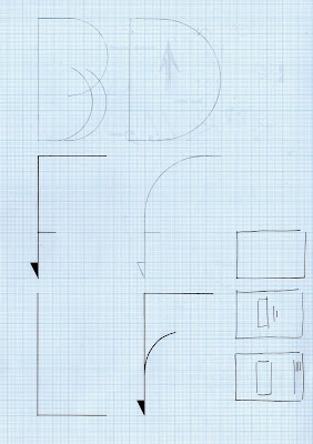
For myself the experience of being is Paris was all about being within a romantic city with someone you love, which is what I did. As a city of love I wanted to reflect this idea in a romanticised typeface that was traditionally serif and scriptive yet have a new and interesting approach that was innovative and different.
Circular treatment to curves I think is definitely appropriate here the use of them give a magical and reflects the idea of romanticism straight away. I started initially working with the A3 spread using the circle to create a sort of pattern similar to the works of Si Scott. But after a while of doing this I felt I was getting too concerned with composition and less about what is really crucial, the typography. So I started looking more at the specific letterforms that make up the word Paris, even just looking at the word I feel it communicates romantic really well, every letterform is round and its pronunciation even more.


No comments:
Post a Comment