Showing posts with label OUGD203. Show all posts

Friday, 28 May 2010

Product/Range/Distribution: Presentation Boards


*Mock-up of installation is to be placed on board 4.

Wednesday, 19 May 2010

Floor Plan: Cross Section & Upper View


Im going to insert the pyramids into the space next as a way to demonstrate how the space will look with the installation within the room. I'll use this to give an indication of how it will interact with the room.

Tuesday, 18 May 2010

Small Shapes: More Perspectives

As a small sample piece I began testing the use of perspective on smaller articles, I would like to create a visual styling that extends beyond just the window scene and the interior visuals. I would like to create visuals for clothing tags and even the clothing itself. I like the use of atmospheric imagery possibly the simple use of this will be enough to like the range of products together. As for distribution I intend to create a mock-up of the website design, this will work with the current design but simply with a change of some visuals and imagery.

To do List:
+ Mock-up the floor plan visuals.
+ Window Display graphics.
+ T-shirt designs.
+ Mock-up an altered website design.
+ Start developing the final boards for submission.
+ Module evaluation (due in on actual module submission).

Aqua Logo: In Perspective


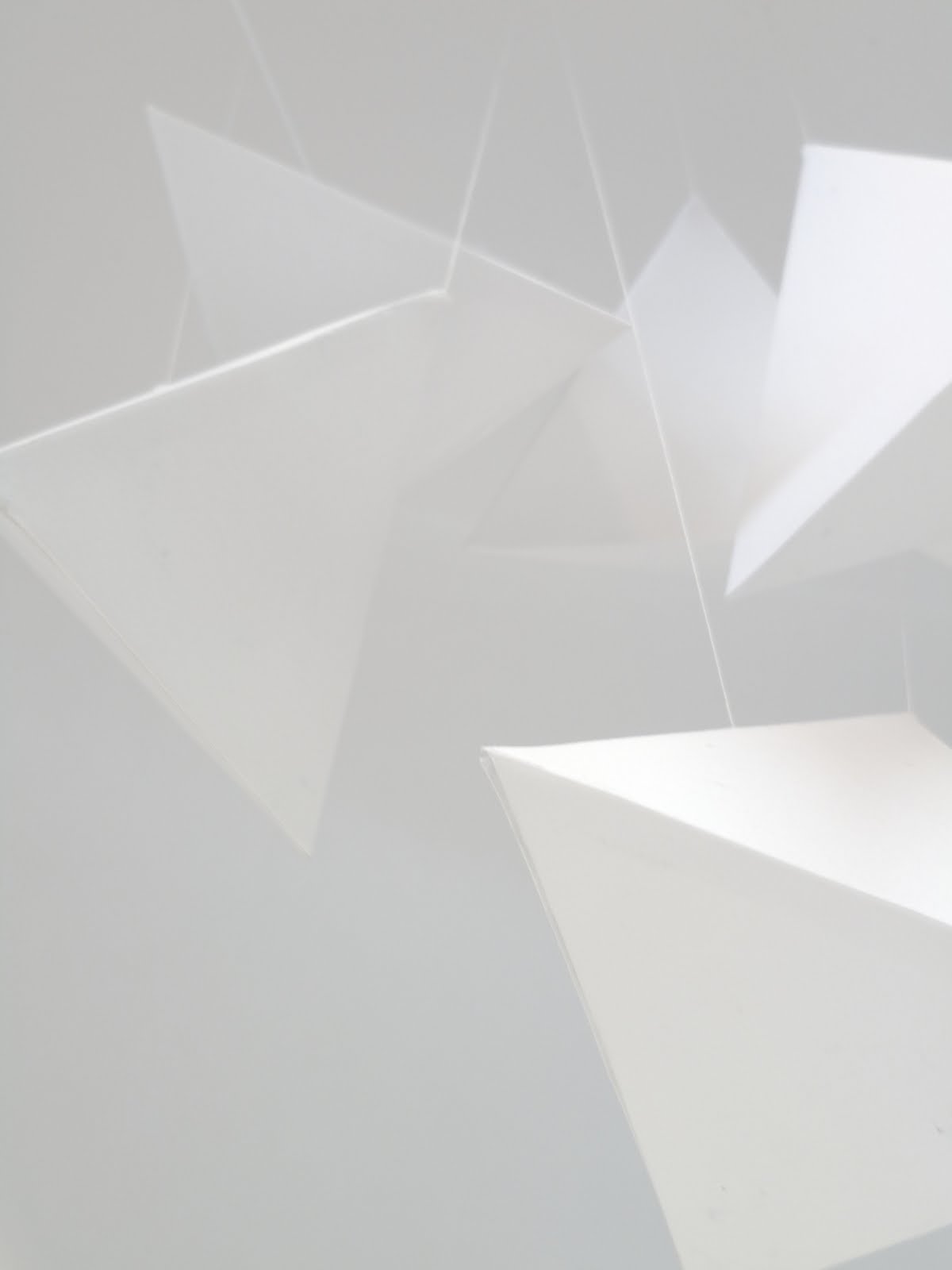
Simple editing using Adobe Illustrator has helped create a much more realistic view into how the installation would operate. I intend now to create a mock-up plan view of the room space, which will allow the design to be seen on the boards for submission. I really like these shots, I love in particular the casting of shadows and the string as well adds to the dimensional aspect of the scene.

Mock-ups of Perspective Installation


A good way to start seeing what it is I want to produce is to make mock-ups. As I have kind of sorted out the design of the shop window space I just need to draw out the design and create visuals. To show how the perspective installations will work I have created a sample below, I personally quite like the look of the minimalist shapes as themselves but I think as a theme, 'Cutting the Atmosphere' works well.

Monday, 17 May 2010

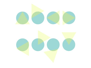
Type Treatments: Circles & Triangles

Abstract Shapes: 'Cut the Air'


After talking to Graham Tansley he gave me some very useful advice in terms of design direction. His immediate reaction to the clothing and what I told him related to the idea of 'Revealing' something. As most of the clothes were not for a practical everyday use and were simply deisgn for aesthetic purposes, it became clear that what I had to produce was something focussed on aesthetic value as oppose to sitting against a theme.
Graham and myself also spoke about the idea of covering the window display entirely and having small cut slits within the window vinyls enticing people to look through to view the clothing behind. Although this concept would be interesting I feel that it would not work enough at getting people to be inspired by the clothing and doesn't entice people to enter the store as it is covered up.


I personally like the idea of a hanging piece in particular something abstract that doesn't have much detail or complicated meaning behind it, purely for it's aesthetical values. At the moment i've been looking more into the cutting of shapes and using them to form this within the space,Felice Varini's work looks at putting shapes into the environment, integrating them into everyday places and from a certain perspective create images. I am going to look at creating visual mock-ups of the kind of visuals I could create using this idea of perspectives.

Isometric Paper: Cut Type


Isometric paper, brings back memories. Type experimentation.

Wednesday, 12 May 2010

Crit Feedback: 12.05.10

Not that I have much to submit at this point but this Crit really helped in terms of clearing up the air and getting that enthusiasm for design back. Having not done very much I was not very surprised that that got picked up on. Overall I felt that the brief I had proposed was really interesting, but I had been doing far too much research into what the company is about and the history of it as oppose to starting to create something new. I also haven't experimented much with colour, having created a colour pallet to work from I haven't actually used it yet, and although I am working with fairly minimal content it would be nice to show some design experimentation involving colour.


Tim's Notes on Feedback/Discussion:
+ Look into artistic movements like Pier Mandrian.
+ Expand the logo into a typeface.
+ Mixing up the themes of seasons; winter environment with summer features.
+ Keep it minimal and witty.
+ Modernist interiors.
+ What do you want to get out of this brief?
+ Focus & clarify your concept.
+ Prioritise again. Focus on the main outcomes, e.g. window display, before thinking too much about the t-shirt designs.
+ Structure your design direction and what you want to produce.
+ Try to get hold of the 'Retail Graphics' issue of IDN Magazine.

Mixing Shapes

I quite the like the mixing of organic and synthetic shapes, using the idea of hybrids and mixing them with collaged shapes. I quite like the effect, would be awesome to have a real version. Giant shapes and objects could always be a winner.

Tuesday, 11 May 2010

Wool Type

As far as development goes, its slow, but I am slowly getting headway on the project. From talking to fred two days ago about the project he basically said i needed to do more practice work and stop trying to look at creating something that is the same as everything else. I needed to brainstorm what A/W meant and create a direction from there.
After looking at hybrid forms I realized what I needed to do was start putting words together and create ideas based on those, hence hybrids. Classic works such as cold were thought of but didn't give me anything to work with. What about the clothing worn at these times, jumper, knitwear and there was the idea, winter warmers. Using that idea of I started to generate a number of idea based on 'Winter Warmers', one was to use wool, the kind that you would normally use for making christmas jumpers and such, and from here I started to develop type.

Monday, 10 May 2010

Post-tutorial Drawings & Direction

After speaking to Fred about things which thankfully has cleared up the air about what has been expected of use from the PPD module, he asked about how I was getting on with the current project and frankly, nowhere. Complete designers block.


Although I have decided that Aqua is about clothing that is separate from the current trends the window display may need to reflect the needs of the current season. So as a starting point I set out brainstorming the A/W season as a starting point. This would get out obvious idea for the window display and so I came up with a number of design solutions. 'Winter Warmers', by using that idea of hybrid for I proposed covering wall to wall of the window display in wool, 'Warming' the window scene in preparation for the window. This idea extended into further solutions of design including the use of a full Spring/Summer window but covered completely in wool.


Overall I feel this kind of solution would work well but I am not fully convinced that it would fit with the existing content of Aqua, the visual styling and material use of wool is something that doesn't seem to appear in their season of clothing. Like the clothing I feel a much more abstract solution would work best with the current design, and more importantly would be more appropriate to their current consumers.