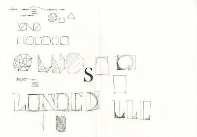
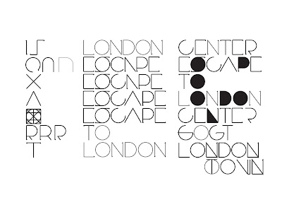
Having been to London a few times its seems to be one of the places I hear about often within design and its true I suppose, there's always something going on in London. But as a place where everything is going on I have fond it hard to come up with something that represents london as a whole, after all it is one of the biggest cities in the world not just a capital of culture. After a lengthly few days researching I finally decided on a suitable solution. That london is simply too big to enclose in just a few words, it is everything jumble up into one city, its confusing and hard to describe. Which is precisely how the typeface should communicate; confused.
Using unconventional circular and square forms I created a look within the typeface although it is readable, requires a second look.


No comments:
Post a Comment