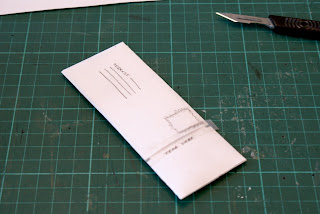
Working with the idea of a mail-shot I started to develop this idea of a fold-out room that myself and hannah were both working on. I came up with an idea that it would fold out into a scale replica. With the idea being that this leaflet/mailshot was designed to inform the recipient of the possibilities that this space could be used for by means of a scale replica you could begin to organise and picture your event 'within the space'. Among other idea I felt this was a really strong visual concept and was an innovative take-on mail-shot and what it represents. This piece could then be kept much like a business card where it could be referenced later on and as the shape of the room wold not change anytime soon the design would not have be altered greatly overtime, just the graphics on the outside and inside of the room space.
In terms of representations I want to look further into what I could produce and what could be more realistic, using this as a foundation I was to look at adding maybe fold-outs and start looking t the visuals which could be place on top of the design, colour schemes, typefaces will play an important role in getting the message and portraying the Fedrigoni company to its clients. Therefore I want to start looking at more design in context to find out what kind of visuals they have had previously and start looking at developing it visually.


No comments:
Post a Comment