Friday, 22 October 2010

Design for Web Workshops

To better my understanding of the capabilities of what design for web can do I have decided to participate I the design for Web Workshops, ran by Simon from the IT Department. Overall I have found the sessions very useful but I think to fully appreciate the full potential of web I need to start getting some briefs that explore this much better. In the short session we will begin to cover the basics of:

+ Dreamweaver
+ CSS
+ Javascript/JQuery
+ Flash (yay)
+ FTP
+ SEO (Search engine optimisation)
+ ISO (Image search optimisation)
+ Wordpress

In-preparation for our next session we are due to look at CSS and so we are to bring a website plan to work with. I have decided to bring my own so I can finally start getting some content and design on there. Admittedly though I think the hardest part was getting the damn thing put there.

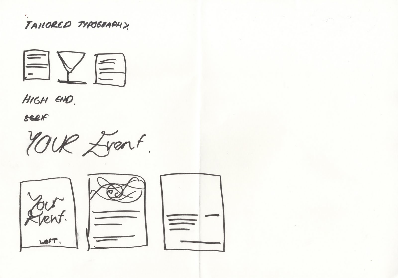
The Loft Leeds Christmas Promotion

With more working professionals expected to come I am really getting excited about the prospect of getting some actual work that is paid. One such company which came in to visit us and hand out some work was Glue Marketing, ran by Jonathan Smith I was really engaged with what he had to say and by taking initiative I had a bit of banter and general design discussion with him which was great. After delivering a presentation he gave us a small brief to complete. Glue Marketing is linked primarily to the bar The Loft, giving them a steady supply of income which the marketing business cannot generate. The brief was to promote the business using a flyer and create a christmas card to be sent out to existing clientele.
After he delivered the brief we were to go away and come back with something to discuss, I really took this opportunity and got some really good/bad feedback about my business card aswell.
The idea that I was working with was to demonstrate using icons the versatility of the venue by mixing them. I felt this was a strong concept that could easily be transferred to different media including posters and advertising on the existing website.
For the card design although Jon had stated he wanted two on the written brief he said he only wanted one that encapsulates our practice and lets us go wild. I based my design using a similar colour schemeing to the flyer and imagery also. Although not wild I wanted to use play-on words using the idea of a christmas tree coming down from the loft as a subtle way of making people smile.

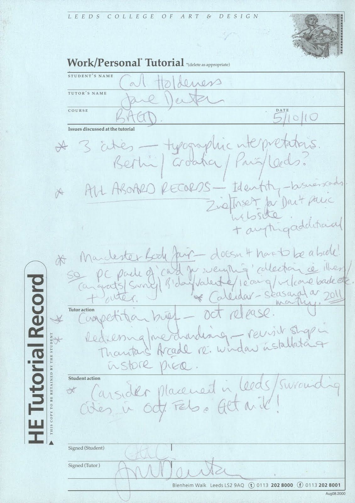
Tutorial with Jane

After briefly speaking to Jane about my summer she immediately pulled me to start looking at getting some formal work experience and make some decisions on the work I am about to produce in my chosen briefs.
Over the summer I feel I was very lazy about getting some formal experience but I feel I still don't have a clue who I'd like to work for properly. I have however started to be much more vigorous and started to look for live briefs and grab any opportunities that I can. Such as the Jonathan at Glue marketing and now taking on the Market Week brief for Bridget I feel I am on my way to getting some valuable work experience.
In terms of briefs I have decided to try and make most of them to some extent live. But unfortunately with taking on more work I have actually had less time to work on the and actually producing work has taken a sideline. I have outlined the breifs I am going to undertake below:

+ Types of Cities
+ Market Week (Leeds College of Art Pop-up Shop)
+ Unfake
+ The Loft Leeds
+ All Aboard Records
+ Meanwood Valley Urban Farm Map
+ D&AD Competiton Brief

Postcard Pack Sample


Although not final I though it would be a good idea to show consideration between the layout of the Greetings cards and the postcard pack. More to come.

Final Greetings Cards Layouts

Although I screen printed these I though it would be useful to show the designs in full. Using a 1 colour pallet with halftone imagery.
Having printed a few of these off to show how they work I have decided that they actually need a lot more work. I think to show the full extent of my experience with screen print I think it would be appropriate to produce another range of cards to show my capabilities to professionals. These designs would be uncompromised by cost using a wider variety of colours, more to follow.

First Greetings Card Samples


Having finally had the opportunity to get back into screen printing I really enjoyed myself. These are the first cards i produced and using the envelopes and bags I already had they look pretty professional. I'm rather pleased with the outcome myself. I have decided to extend to range of these further by creating some postcards.


Greetings Card Designs Update*

I've been trying a lot of different things what I could do with the placement of the letterforms and images but one thing which I have tried to keep the same is the format of the greetings cards. Having previously created some cards I have a lot of leftover cellophane bags and envelopes which I can use so cut down on the cost of producing them I have decided to keep the format to cut costs.


I've also been trying to experiment with the images to make that screen-printable. using a halftone effect seems a pretty easy way of getting it to work but using the right amount of dots could be tricky. I am however really liking the way they are starting to work as a set.