Friday, 26 February 2010

Timetable 01

Nicknamed by us as the "Timetable of Doom", myself and Hannah decided to create a time plan to which we could begin to organise our time properly before we get lost and start missing deadlines and such. This was also very important as we both have other commitments, we both have part-time jobs at different times, I also live 7 miles away from college whereas Hannah lives less than 700 yards. We have however given ourselves a base from which we can work on and can use our time effectively when we are together and when we are not. After all it is important to remember we both have a critical studies essay, a Type module and a Business to think of. I think I mentioned everything.

Chosen Brief & Rationale

For the project we are to choose a given live brief from the YCN competitions which we are to submit within just over 4 weeks. But which one and why should we choose it? Myself and Hannah decided that we should think hard and shouldn't compromise on a good/bad brief, after all we are designers that can both produce something spectacular for any brief. I myself was straight away interested in the Ted Baker brief, window dressing is my frontier and visual merchandising is a past-time from working in my part-time job, how perfect. But Ted Baker is a huge company with a massive following and so would be very popular with other designers aswell, winning would be much harder. We also as a team looked at "Feel Good" Drinks, a new company looking for some serious promotion and had links to the CocaCola company, again very high profile and the competition not just from the design community but from other peers would be huge. This became apparent when we raised hands to show which brief we were doing.
So we changed it. Fedrigoni is a paper manufacturer within london looking for a way to promote it's showrooms to its clientele. A less profile based company which on closer inspection showed to have a really interesting, passionate practice and had fun. With the showroom to be promoted they use the space really well, games nights, exhibitions, get-togethers and meetings obviously.


After submitting our rationale we contracted our agreements to each other regaring our resposibilities in our partner ship but also agreeing on the fact that the outcome of the brief is both mine and Hannah's equally. Fun.


Getting Ideas out and into the Open

No messing around would be the key to the success. After doing some initial research, Hannah quickly proposed that we put pen to paper, to get our initial ideas out and into the open. We decided as a pair we should get five ideas jotted down or even drawn, simply so that we could move on we wouldn't be tempted to just stick with an idea just because its the only one we can agree on.

Idea 01.

Looking at the idea of paper engineering I thought about the ways in whihc the paper can be manipulated, cutting, folding etc but how to make it playful and engaging and original? I thought about the ways I have maipulated paper before and then it can to me, paper mache. It about play but could also be used to consume waste paper, hence the title " We at Fedrigoni, don't want to waste anything, especially our showrooms."


There were other concepts but as a start I developed a series of ideas based on craft and use of the paper. To not spoil the surprise later I'll leave you with the drawings, I don't want to give too much away to my competition. [Below] Concepts 2-5.


Tuesday, 23 February 2010

OUGD203 Briefing Introduction

The next brief I am to be working on is a live collaborative brief. We are going to be a body of work to be submitted on presentation boards to the YCN (Young Creative Network) whom are holding a series of competition briefs for various clientele, including Google, P&O, and other well known brands. A great opportunity to possibly win something but also produce a fantastic portfolio piece.
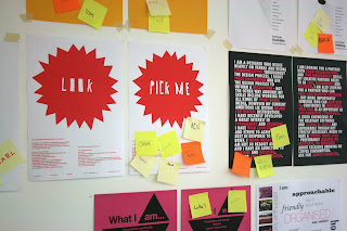
But who to work with? In previous partnerships I have worked with Hannah Jackson whom with I get on really well and still do today, but what if there is a better partner? As an exercise over the course of an hour we were to produce some advertisements for ourselves to not only to show and promote ourselves but we had to also create an advertisement for our perfect partner. So with a good 45 minutes work and a 15 minutes dinner (I don't think I'll ever get used to those dinner breaks) I produced two very similar in appearance but I thought would stand out from the competition.


After creating our master pieces we displayed them and had to respond to three adverts by placing a post-it on them. Given there were over 40 you had to be selective, very selective. In my chosen criteria I was looking for someone who wanted to make decisions, seize the day, have a good sense of layout qualities, have some skills on the computer and be interested in print-based media as well of course being fun and loving a good cosy dinner break.
I chose Tim whom has fluent skills in software, was interested in gorgeous layout and was a rounded designer, I thought I could bring him some skills in conceptual thinking, use of craft and image making. He also seemed much of a team leader which is one of the qualities that Iam looking for.
I also chose Ian based upon his interests and reputation as both a good illustrator and layout qualities, I chose Ian also because of what he was looking for in terms if creative traits, in particular of "Image making through less illustrative means".
I also chose Hannah again based upon previous experience and what she was looking for. I wanted a team player and someone whom would allow me to work with them and work in such a way that I wouldn't feel undermined by my partner whom would intervene rather than let me get on with what I wanted to do, a more relaxed way of working if you will. She also wanted someone to organise her and someone to get her motivated and help sustain her working practice, she also has a keen interest in typography and from previous experience a practice that centered around paper-craft, eco materials and packaging. I chose Hannah.

Friday, 12 February 2010

OUGD202 Design for Digital Media

1. Your ability to select, develop and evaluate a range of appropriate source material gathered through a breadth of appropriate research methods.
Sourcing good visual material for this project i found was the hardest part as there seemed to be few idents that almost directly linked to the subject in hand. I did however find inspiration through primary research by visiting the YSP to view the Rob Ryan Exhibit which provided a great inspiration point in terms of the look and appearance of the later to become idents, inspite the fact they were not animations. Saul Bass provided some ideas about using vector graphics to communicate and i also looked at stop-frame animations as a possible visual quality which i experimented with later on.
For the design of the dvd menu and the packaging the designs were inspired through the ident's appearance and so i developed my designs for them not based upon other examples of packaging, this helped to keep a consistency and not let other designs of packaging dictate what it is i wanted to produce. Looking back i should have looked at a few more that were relevant such as valentines day packaging, however i feel the design speaks for itself and furthers empasises the twist of the films being horror/gore for Valentines.
2. The level of investigation and experimentation into appropriate production media, processes and technologies.
Having previously worked using simple animation skills before i had a grasp on what could be achieved however i had never used after effects before to create animations. So starting from scratch i found the initial sessions really helpful in terms of getting to grips with the new software, i gained valuble knowledge about creating simple shape layer and movement of objects within a 3D environment. I produced various test pieces, some more seemingly random than others but i feel i showed how i got to developing my skills really well.
Staying away from the software i was able to show in detail through storyboards what it was i wanted to produce and working by hand allowed me to develop concepts that were visually engaging. Working with the computer as a tool i was able to develop an understanding on how to use after effects effectively.
3. The breadth and quality of practical skills, ideas and development.
Working away from the computer i planned the ideas before coming onto screen, i feel i let my designs take the fore-front of the project and not let the software dicate my designs. Of course there were exceptions mainly due to time availability. I feel i have produced some strong digital media pieces which have been massivly helped by putting in long hours of work and experimenting to get what i actually wanted from the software. A particularly useful part of the design was working with a limited colour pallet, this enabled me to work with a higher consideration to actual movement when animating objects, in terms of technical competance with using after effects i feel i have established a good basis of knowledge.
Obtaining realistic physical movement that flowed properly became something the i pressured heavily on the look at feel of the work i produced. Making slight adjustments to create a realistic drip set a standard for the rest of the work and so using the Graph Editor tool became one of the biggest tools used to obtain an accurate acceleration and flow of movement which translates into some really successful looking idents where inspite their hand-crafted appearance look and feel as if they are based on real-world physics.
I also experimented using hand-drawn animation based upon research that i had done and crit feedback, i managed to produce a short sample and quickly analysed that i would need a lot more time to complete a fully moving object in stop-frame animation.
4. The documentation, organisation and presentation of the work for this module.
For the Silent Movie brief all of the designs were produced on time and ready to deliver in presentation. For the Initial presentation of the Film Season i think i gave a consise and wealthy amount of information that supported my decision making through use of clear points and being really confident about my idea. I would personally liked to have involved some actual footage involved in my presentation to give a better idea about what it was i was looking at but unfortunately i still havn't been able how to fit moving image files into Powerpoint. For the next presentation of the 6-frame storyboards, again i was well prepared and illustrated what i intended to do really well, and then i was able to consider use of texture and handcrafted design from the feedback that i recieved.
In terms of time management i was able to complete my work on time with allowances for errors and unfinished work but after working so long i feel if i were to continue the work i would need and animator to work the animation for me.
5. The success of your final products in relation to the briefs.
I aimed to produce a series of 5 10 second Idents for a season of horror/gore films for channel five over Valentines weekend for a predominantly youth/male audience. I feel the work that i have produced suits that particular audience that i set out to design for and shows a good contextual understanding of not only the films but also about Channel Five's audience and identity as a whole. They have also been completed in terms of technicality at a high standard where through concerns about detail make the compositions work on a much more realistic pace.
For the design of the DVD although i did produce it to a high standard with good interactivity i should allow more time for proper proofing, this would help clarify any small mistakes such as spelling and grammar but also to ensure that the quailty is consistent throughout as some of the menus do become pixelated greatly.
In terms of the entire delivery i feel that i have completed this brief with a good considered design solution the has a distinct visual quality and effectively communicates its promotion of a good concept of films.

5 Things I will do differently next time and comments

Take more breaks when working on long-winded session on the computers.

Use more detailed storyboards to show more depth and pace of not just the moving image but the sound and when/where it might appear.

To shorten the amount of workload consider creating assets before working into DVD Studio.

Research possibly into greater depth After effects tutorials which may be beneficial in the development and help me gain a better understanding of the software.

Allow more time for testing and corrections if needed .
Final Packaging with DVD Enclosed

Packaging Design Development & Testing

DVD Studio Pro
Designing and Making (11 1/2 continuous hours)


DVD Studio [Continued]:
Production & Design Development


Silent Movie Finals:
Crit Feedback Changes for Clatter 03 Final

Having been using the DVD studio and being ready to upload the final videos and such I have chosen to slightly alter Clatter 03's camera angle to make the transition much more smooth and much easier to view. Below is my previous final, where the camera suddenly changes swiftly and leaves the scene. Having learnt more now about after effects I quickly changed it, by simply having a camera that panned across and moved much more in sync with the design of the rest of the clips.


[Below]: The revised version of the clip, much easier to follow with a smoother motion.


DVD Menu
Production & Design Development

This was probably the most tedious part of the project, overall i spent approximately 11 1/2 hours just assembling and making each menu work properly, i also spent more time making the individual menu Transistion which i will refer to here.